Wednesday, October 31, 2012

~ Frightfully Delightful ~

"Witches and Goblins and Jack-o-lanterns bright,
Creep through the town on a cold October night!
You hear the sounds of running feet but nothing can be seen,

And the strangest things can happen on a cold Halloween!"

Happy Halloween everyone!

Since my kids are far too old for trick-or-treating, I decided to make a memory Halloween mini album with all their photos from the last 15 years.  Its a great way to look back at all the happy Halloween memories.  Here is the front cover... love the black crow on the fence!
And here are just a few of the pages inside the mini album.
All of the pages have pull-outs that include more photos of the kids... 
...and I sewed each and every costume


 The little flip book is tied closed with matching ribbon.
Getting a little old for trick-or-treating.... off to an adult party in a 70's disco era costume!

Tuesday, October 23, 2012

Life is Good


This is Part 3 and the final part of the Photo Manipulation Masterclass feature that I did for Scrapbook Magazine UK.
This week I will show you a color changing technique used in a photo.


Step-by-Step for Color Changing Technique

Open your photo in Photoshop Elements
You are working with layers so you must have your “layers” window open:
Choose Layer
Duplicate Layer
Label this as your “Background Copy"
Working with your “Background Copy”
Choose “Enhance”
Convert the image to black & white
Choose your eraser tool
Choose a brush size that works for you:
Smaller brush for small intricate areas and a larger brush for open and larger areas.
Brush over the photo the areas that you want the original color to show through.  As you run your eraser over the black & white photo the color will start to show through.
Once you are happy with the outcome, “Save” your photo.

This is the unaltered photo

This is the altered photo
And this is the layout that I created with the photo "Life is Good"
Here are a few close-ups of the layout using the 7 Gypsies "Lille" patterned paper line.
I inked and distressed all the edges.
 Created my own banner by printing the flag and adding some string.
 Added some red ink to the corrugated cardboard.

Just a few tips:
Remember that the color red is the easiest for humans to see, so it makes perfect sense to use red to your advantage.  As in the photo of the red phone box which draws you in immediately.
Mat the photo on cardstock that makes the photo pop.  In this case I used black to highlight the red in the black and white photo.
Add dimension to your layouts.  I used a torn piece of corrugated cardboard, distressed and inked the edges.
Use a mask and some coordinating acrylic ink to add dimension and a pop of color to your layout.
Distress, tear and ink your paper edges.

If you do not have access to a photo editing program you can try coloring in an image on your black and white photo using colored markers.

If you want to add a pop of color to a black & white photo consider adding a ¼” mat of bright colored paper behind the photo.
Crop your photo to highlight the focal point.  In this case I cropped my photo to remove unwanted people walking past my subject.
Remove unwanted images from a photo by painting over the image with Gesso.


Tuesday, October 16, 2012

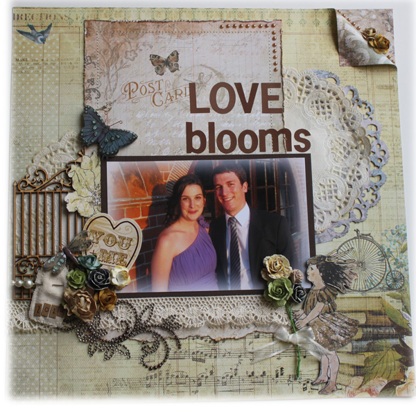
Love Blooms

This is Part 2 of the Photo Manipulation Masterclass feature that I did for Scrapbook Magazine UK.
This week I will show you how to feather or soften the edges of a photo.


For me personally, enhancing and altering my photos is part of my hobby of scrapbooking.  I am doing it to make the subject more visually interesting and I am simply trying to make it a better picture which, in turn, makes my layouts more appealing.
I don’t do it on all my layouts but I find it very relaxing to sit and play with my photos.  I enjoy the message that the photo brings and if I can enhance that somehow, it makes for a much better layout.  It really comes down to an individual choice, but whatever we choose to do with our photos it’s all about creating a reflection of what is important to us, the memory that we are creating and the joy we get from participating in this great hobby.

Step-by-Step for Feathering a Photo
Open your photo in Photoshop Elements

Select the rectangle marquee tool
Draw around the photo leaving ¼” to ½” border around the edge
Select
Feather
100 pixels (or more if you want a dense feathered look)
Select
Inverse
Edit
Fill Selection
I use “white” to soften the photo but you can choose any color you like
If you are happy with the outcome, “Save” your photo.

This is the original photo
Sorry, it's a bit blurry as it was taken with a camera phone in direct sunlight.

And here is the photo with the edges feathered for a softer look on the layout.
... and a few close-ups of the layout.
I used the "Nature Garden" patterned paper collection from Prima.
I fussy cut around the girl and added a small bouquet of flowers tied with ribbon.
 A row of pearls and flowers along the folded edge of the corner.
Tim Holtz die "Distressed Doily" in blue and an inked white paper doily.
-        Feather or soften the edges of the photo using a color that blends with the photo.  You don’t want the edges to stand out and be noticeable.
-       Using the Lasso tool, you can feather in different shapes around the photo, eg: oval, circle.
-       Feathering creates an elegant look for a photo.
-       Convert your photo to Black & White or Sepia to create a softer look.
-       Mat your photo onto cardstock that matches the patterned papers you are using in your layout.

Other things to try if you don't have access to a photo editing program such as Photoshop:

-       Inking the edges of your photo with ink on a foam blending tool can soften the edges of a photo.
-      Tearing and edge distressing the photo can also add a different effect to the photo.
-       Sanding the edges of a photo tend to soften the image.
-       Mist the areas of your photo that you would like to distort with water and gently sand over top.  This technique will distort the image and leave a gorgeous golden tone.  This is best used on a lab-processed photo and not on photos printed at home.
-       Try printing your photo onto canvas.
-       Try printing your photo onto book paper or heavy textured cardstock.
-       Try printing your photo onto transparency paper, letting the patterned paper or card stock show through the photo on your layout.

      Next week I will show you how to highlight one color in a photo.

Tuesday, October 9, 2012

Here is Where Our Story Begins

This past Spring I was again asked by Scrapbook Magazine UK to do a feature.  Lindsey asked me to do a Photo Manipulation Masterclass feature for issue #67 in the Fall.  This was right up my alley.... I love playing with Photoshop and to be able to create and document  step-by-step instructions using Photoshop techniques was a challenge that I was excited to take.

Taking an original photo and altering it using a program like Photoshop can absolutely be art .  Most of us do the basic cropping, sizing and rotating of photos but there are also many different ways to alter a photo with tools you have on hand in your scrap room.  Some pictures that I take are transformed into entirely different looking images just by altering them.

 My main reasons for altering a photo would be:
           Fixing a problem without altering the integrity of the photo, such as making a picture  brighter or less blurry. 
      Changing the aesthetics of a photo by removing all or some of the color, changing it  to  black & white or sepia.
      Making minor adjustments such as removing a blemish.
      Removing unwanted images such as a garbage can, a tree or buildings behind  someone’s head or people walking past.

Due to the popularity of digital cameras, there are numerous digital editing programs readily available.  My favorite is Photoshop Elements but if you cannot afford to get a copy of the program there are several basic image editing programs on the internet.  Photobie, Photo Editor, Photoscape, Paintstar, Picasa, Microsoft Paint, just to name a few that I have seen.

I chose three techniques and created three layouts for the issue that was released this week.  This is the first technique and the others will follow in the weeks ahead.

Step-by-Step for Adding Text to a Photo

Open your photo in Photoshop Elements
Select the horizontal type “text” tool (T)
Choose your font type, size and color from the top selection menu
Type your text on the photo choosing the large green check if you are satisfied or the red circle if you would like to start over.
"Save" your photo.

This is the original photo - unaltered

This is the photo - cleaned up, converted to B&W and text added

And here is the "Here is where our story begins" layout
I used the "Bo Bunny" paper line and even created a shadowbox clock with transparency film and micro beads.  I also inked and distressed all the edges of the paper and each clock face.


I love stitching on all my layouts so I stitched the large clock die-cut onto the background cardstock.


       Remember to create your text in a color that shows up on the photo
            Place your text in an open background area of the photo so that it is easy to read.
       Mat the photo on cardstock that makes the photo pop.  In this case I used burgundy to  tie in with the   burgundy on the clock pieces.
           Highlight one of your embellishments on your layout.  On this layout I made a window   in the largest pocket watch using some transparency & foam squares.  Then I   added some free floating beads inside the watch’s window.
       Distress, tear and ink your paper edges.

-         If you don't have a photo editing program, you may want to consider typing your text  onto a piece of transparency and placing it overtop of your photo.
      There are several permanent ink markers that you can use to write your text directly onto the photo.
       Add rub-ons to a photo.
       Use journal blocks or quotes printed on the manufacturer’s papers as your title or text  on your layouts, as I did on this layout with my title.
       Create a photo that goes along with a favorite song title or quote.

Thanks again to Lindsey for this amazing opportunity.  Next week we will look at feathering the edges of a photo to soften the look.

Monday, October 1, 2012

The Altered Brush Project

Scroll down to the bottom of this post to see who won the Giveaway....

CHECK THIS OUT.....  Donna Downey Studios
Mine is the pink one on the far left and the 8th one down on her blog post this week.

I am excited to be participating in the Donna Downey Altered Brush Project.  This was a fun project to create and I loved that I could make it showcase what I am all about.  Of course I chose PINK and my theme just had to be sewing.

Started with purchasing a 4" painter's brush from Donna Downey Studios and then went to work painting and designing my brush.  Here is the finished project.
And.... a couple of close-ups.
I painted the bristles pink and blended it into the white on the tips
Added some thread cards, buttons, pin, flowers and rhinestone bling.
 Some pearls, lace and tulle on the mannequin.
  A rub-on ruler on the brush handle along with some buttons and rhinestones. 
 I added some bling to the tulle.
Painted the handle pink and used a sponge technique with white paint over top.
A strip of fabric around the middle of the brush with some lace on the border.
Some vintage lace over-lapping the fabric strip.
 
Donna asked us to attach our signature card to the paint brush and sign and date the back of the brush.
I just loved this idea and her bathroom walls look great with all the brushes hanging on them.
Wish I could see them in person - maybe some day!

If you want to see some amazing talented artists and join in on this fun project, check out Donna's Blog as well as her Pinterest page.

And finally..... Congratulations to Hubba who won last week's giveaway.  Chosen by Random Number Generator this was her comment.

Hubba said...
I'm a new follower and what a fun giveaway! Hmm, I love so many crafting projects, probably using my cricut and making season banners is my favorite. I can use some pretty paper and decorations as well! Beautiful doll house as well, some kids are going to have a blast